Defining Data: Roadmap vs Lifecycle
The first step in any data project is to understand the scope of data and the processes that data goes through. Many approaches for doing this exist, with trade-offs between simplicity and accuracy. This document will describe the two approaches we have taken, acknowledge the limitations of our initial approach, and outline the motivations behind the shift to our current strategy.
Defining a Data Roadmap
As the name implies a roadmap is a clear path where something moves through the steps in a logical and predictable order. This makes for easy communication and visualisation and often represents a “typical path”.
For example, in our project we initially defined a roadmap with five phases.

This gave a clear path that we expected the data to follow from being collected all the way to the outputs generated from analysis of this data. The first two or three times we filled out this roadmap everything went smoothly. Occasionally we had to massage something to fit within the defined phases but generally it served as a useful tool to take a broad view of our projects data.
As we broadened the scope of our data however and began to define more roadmaps with this format the limitations became clear. Not all data moved in clean lines from one phase to another. Many phases were repeated, some steps did not clearly fit within a phase, and some data never went through certain phases at all.
On top of that the phases we had defined had some pretty clear issues themselves. In a review of the roadmap and the process of defining the phases the data went through we identified some key flaws in the system.
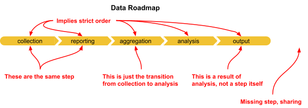
The most important flaw and the one that had the largest impact on the value of the analysis was that a roadmap by definition implies a strict order. When designing processes for collecting and using data it’s easy to assume that it will move nicely and predictably through these well-defined stages but in reality data is messy. Often being collected and analysed over and over again with many overlapping phases.
A final failure of the roadmap was that it did not collect critical information. How is the data stored? How does data and analysis get shared with stakeholders or the public? What is the importance of the data or phase itself?
In trying to answer these questions (and reading the article The Fiction of the Data Lifecycle by Beck Strickland) we began to define our Data Lifecycle.
Defining the Data Lifecycle
Addressing the challenges of a strict data roadmap led us to a lifecycle diagram that allowed for more flexibility in the data structures that we were identifying.
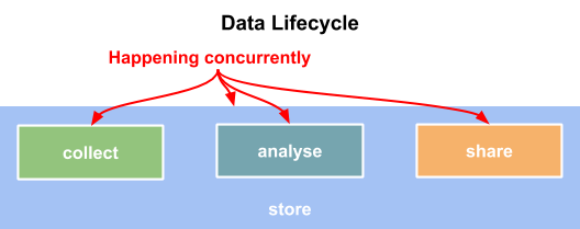
In response to the flaws identified with the roadmap our data lifecycle diagram combined the 5 phases in the roadmap into just two processes, collection, reporting, and aggregation were combined into Collect and analysis and output were condensed into Analysis. The lifecycle diagram also adds a third process titled Share.
The new diagram also acknowledges the importance of storing data at every stage. Data storage and the mechanisms of sharing data were two things the original roadmap didn’t explicitly outline and therefore were difficult to record.
The most important change the lifecycle makes is removing the arrows. Data doesn’t move through steps or phases in a single predictable order and the lifecycle diagram helps us show that. By removing the arrows we have the flexibility to view each phase in our lifecycle as a complete process instead of a single step.
In Practice
So what does this all look like?
First let’s look at one of the first data roadmaps we identified:
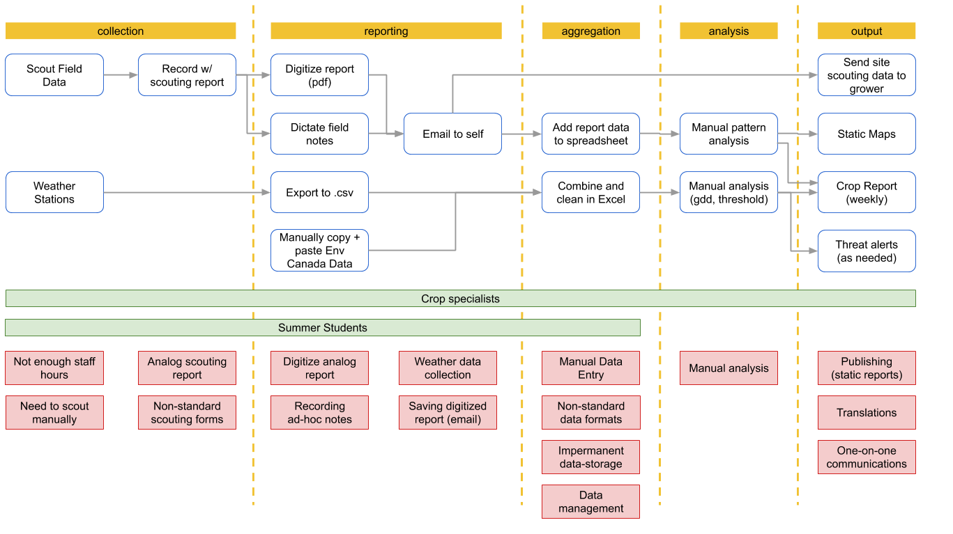
This is a fairly good representation of the data and still has use as an illustrative tool but it leaves out too many key factors.
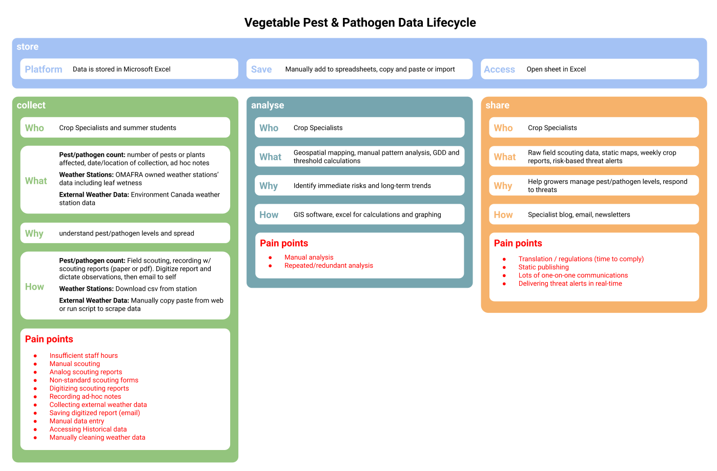
This doesn’t look as clean as the roadmap with simple steps and lines to follow but it’s much more true to life. The lifecycle is also much easier to compare across datasets to identify common challenges or points of friction.
Conclusion
It’s important to define the processes data goes through within a project scope so you can address any challenges that may come up. There are lots of different ways to do that and each project is going to approach this in a different way.
Our project started by identifying a clear data roadmap but in practice discovered a number of flaws, the biggest of which being that a roadmap implied a clear progression through the phases and did not allow for the reality of many phases happening concurrently.
Our data lifecycle diagram addressed this flaw and outlined some critical points that were missing in the original roadmap which allowed us to gain a better overview of the data in our project.
